Watch these two commercials from Apple and Motorola. Which one is simple? Which one is complex? Which one highlights the features and benefits better? Which one makes the design the hero? Which one communicates a stronger, clearer message?
Use the observations you gather from these two videos and apply them to your presentation. How can you make your presentation simple and clear? What is distracting in your presentation? How can you make your design the hero of your presentation?
Slide RulesThe big idea of any PowerPoint presentation is that is should be
simple and
clear.
Here are some ways to make sure you have a simple presentation:- Use as little text as possible
- Use as few slides as possible
- Use large type (at least 30 pt.)
- Do not use bullet points
- Use stock images, not clip art
- Use simple graphics
Examples
Check out the following versions of a statistic slide. Notice what works in a slide.

Bad- Too many words
- Boring clip art
- Picture has no connection to statistic
Still Bad- Boring background
- Chart is hard to read

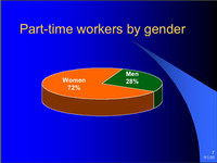
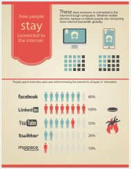
Great- Few words
- Clear chart
- Relevant background
- No clip art

Great- Few words
- Important info is highlighted
- Relevant background

Great- Even fewer words
- Important info is highlighted
- Relevant background

Great- Few words
- Relevant background
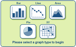
Charts and Graphs
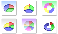
Use
ChartGo to create any graphs you might need.
If you have enough data, you can use
Easelly to create awesome looking info graphics.
Don't be a Bozo
Finally, check out this video on how to give a good presentation using PowerPoint. Make sure to pay special attention to the second half of the video, which is all about how not to be a bozo.
Note that we will be speaking for 5 minutes and have about 7 slides. (Not 10 slides and 20 minutes.) The bozo stuff you still need to listen to, though. :)
For various reasons, a number of students will need to work on their business letter over the weekend. The intention of this post is to give students and parents all the resources they need to be successful.
Video Instruction
The last few words of this video are cut off and there a few grammatical errors. Normally, I would take the time to correct these, but I don't have much time right now and I wanted to get these tools in your hand as soon as possible. Thank you for your understanding.
Content of Letter
•Hook
•Introduce self/group
•Introduce design
•4/5 SCOPE
•Problem
•Solution
•Logical
•Emotional
•Features
•Benefits
SCOPE Helper

| 1-_scope_-_definitions.doc |
| File Size: | 26 kb |
| File Type: | doc |
Download File
Example Paragraphs
These paragraphs are not perfect, but they are a good example of how to structure your business letter paragraphs and give you ideas of how you might communicate your ideas.
Introduction Paragraph
Hello, my name is Randy Johnson & my invention is the Quick Fabulous Hair. (QFis a fantastic idea because it reduces wasted time in the precious moments of people’s mornings. the QFH briskly dries wet hair quicker than any other products with its special suction devices. Additionally, it brushes the hair in a way so there is no pull or pain even in the most tangled hair. And furthermore the QFH has a very simple control pad for choosing a unique style.Lastly I invented this because I wanted to help other people and myself save time, effort in the morning and leave home looking fabulous. This highly efficient product has proven itself to be useful as seen from the responses of the public. Therefore, statistics and comparisons will also prove to you this really works wonderfully.
Body Paragraphs
Statistics and comparisons show that the QFH works effortlessly and everyone loves it. To begin with 92% of the people surveyed said it worked outrageously well and it made their hair look and feel noticeably more shiny and stylish. Also it makes doing your hair so much less of a hassle by fixing up the hair so quick with no pull or pain with the super soft brush. It can do all kinds of horribly tangled hair.Lastly, this is way less expensive than buying so many individual and harmful products, and it saves you so much storage space. Who wouldn’t want that?! Clearly, statistics and comparisons prove that this works extravagantly well, but predictions from what experts might observe say that too.
Predictions, experts, and observations show that this is quit useful and unique.Well first off, I think everyone will be buying this along with you because it makes life easier and saves you so much.I guarantee nobody will turn back to the terrible old ways they’ll all be getting what’s new.Likewise, some of the greatest stylist say they have never seen anything like it that actually works like its advertised, and doctors say the chemicals are absolutely harmless because they are all-natural. Finally, Kari Dickerson, being one who always loves a trustworthy hair styling products for a good price uses this everyday. She has never been late or delayed for anything for taking too long doing her hair since she received it. In conclusion,this is the best of the best hair styling products around proved by observations of people, smart expert testimonies, and realistic predictions,even though there may be some who are skeptical about it abilities.
As you begin getting ready to persuade investors to invest in your design, think about its features and benefits. Be sure to include both in your pitch!
Features 1. A car uses Pandora to listen to music.
2. These shoes come with extra insulation.
3. This car gets 35 miles per gallon. | Benefits 1. You don't have to carry bulky CD's. You have access to a much wider music selection. You'll be able to find new music easily.
2. Your feet will be warm!
3. You save money and don't have to stop at the gas station as much. |
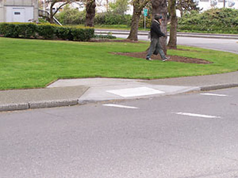
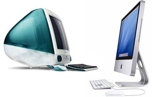
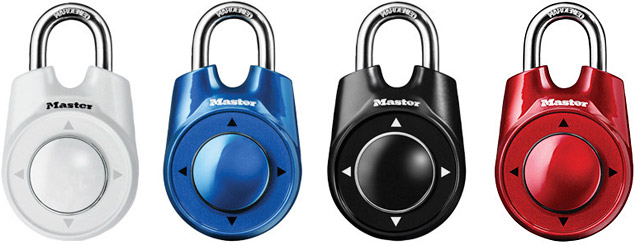
Design solves problems. Here are some great examples of designs that solve problems. What problems do they solve? Are they complex or simple?
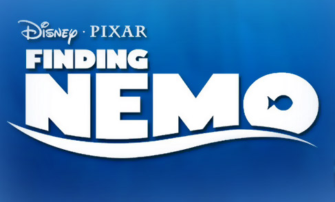
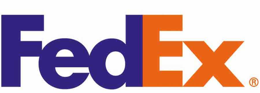
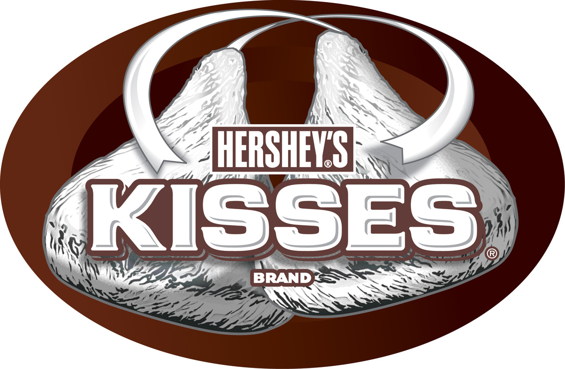
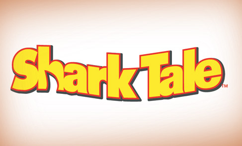
You probably can easily notice how negative space was used in the Finding Nemo and Shark Tale logos...
...but can you see how it was used in the FedEx and Hershey's logos?
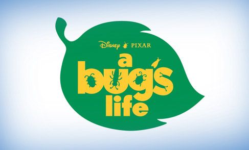
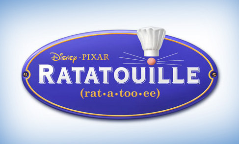
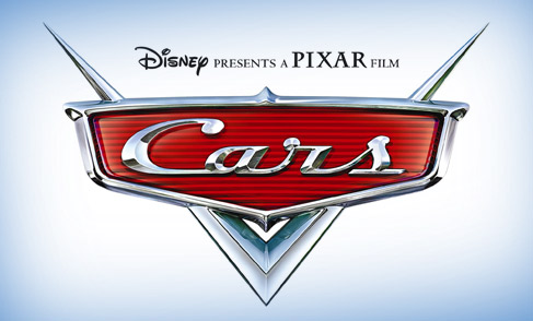
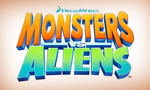
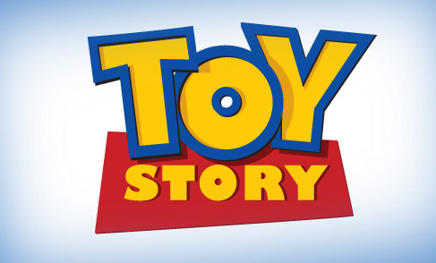
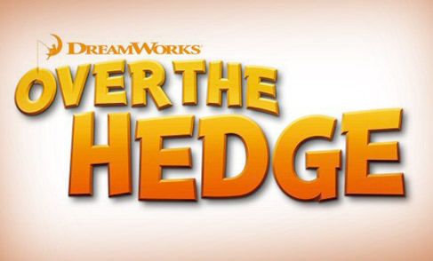
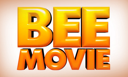
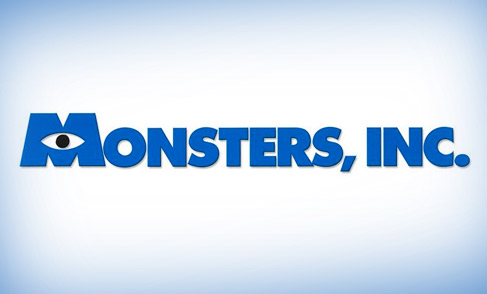
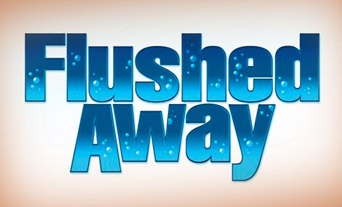
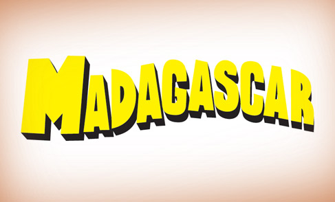
Check out the following logo/titles for popular Dreamworks and Pixar movies. Which ones work well? Which ones don't? What tricks to the effective logos use?
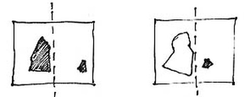
As you design your Canada poster, think about using the design principle of balance. For example, let's say you have to place a large object and a small object on your poster. They are very different sizes, but you can still balance them by placing the large object close to the center and the small object close to the edge.
Alternatively, you might consider balancing one large object with a number of small objects. Something doesn't have to be symmetrical to be balanced.


 RSS Feed